

NO FILTR PMU + SKIN
LUXURY BEAUTY STUDIO BRAND IDENTITY & WEB DESIGN
She's giving... expensive taste

No Filtr understood that premium treatments deserved a premium first impression. The challenge wasn't creating a prettier logo or a more polished website, it was building a brand experience that reflected the level of artistry, care, and confidence clients could expect before they ever stepped inside the studio.


Because people buy the feeling before they buy the service.
Permanent makeup and skin treatments are deeply personal. Clients aren't simply investing in brows, skin, or cosmetic tattooing—they're investing in confidence.
Every decision throughout the project was guided by one question:
"What should someone feel the moment they discover No Filtr?"
The answer wasn't luxury.
It was trust.
Luxury simply became the natural result.
[ THE VISION. ]

[ THE DIRECTION. ]
A premium experience starts long before the treatment.
The strongest beauty brands don't compete on price. They compete on perception.
Rather than following the soft, predictable visual language that's become expected within the beauty industry, No Filtr was positioned with confidence, restraint, and intention.
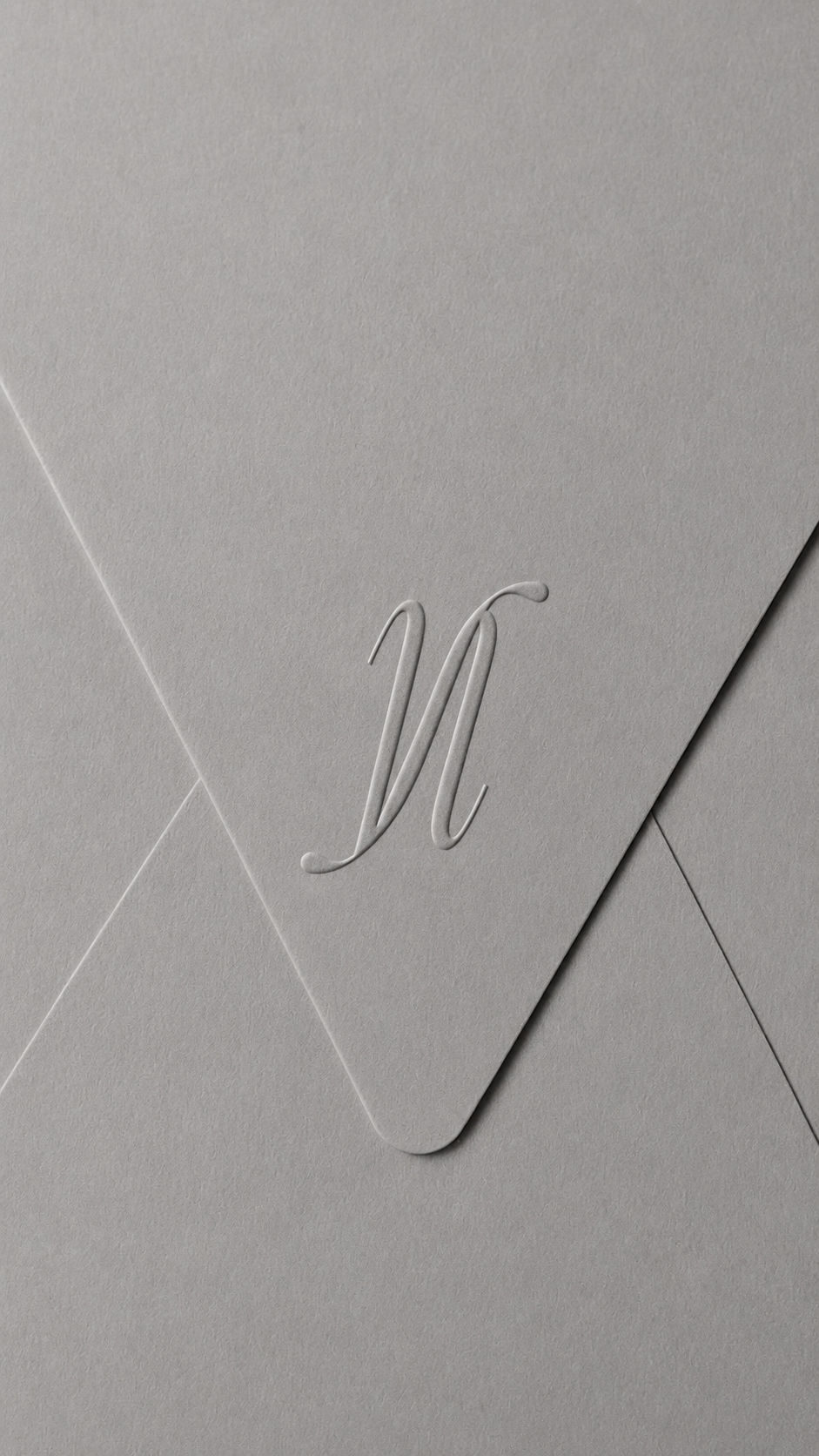
Elegant but bold typography, purposeful white space, a distinctive custom monogram, and an elevated color palette all work together to quietly communicate the same thing: you're in good hands.


Nothing feels excessive.
Nothing feels trendy.
[ THE IDENTITY. ]
At the heart of the identity is a custom NF monogram, symbolising the relationship between artistry and confidence. The N and F also form a subtle butterfly shape, nodding to the client’s previous Canva logo in a more refined and elevated way.
The custom monogram construction reflects the precision required in permanent makeup, while generous negative space keeps the identity feeling refined and effortless.
A carefully curated palette of black, white, warm nude, and signature orange creates a recognisable presence that feels sophisticated, contemporary, and distinctly No Filtr.
Nothing is included without purpose.


[ THE WEBSITE. ]
First impressions deserve just as much attention as the appointment itself.
A beautiful identity can spark interest. A great website builds belief.
The digital experience was designed to guide potential clients effortlessly—from discovering treatments and exploring the brand philosophy to feeling informed, reassured, and ready to enquire.
The goal wasn't more pages. It was more confidence with every click.


[ THE OUTCOME. ]
The business didn't become different. The perception did.
Today, No Filtr feels every bit as refined as the experience it delivers.
The branding and website work together to communicate quality before a single conversation takes place, allowing the business to attract clients who value expertise, attention to detail, and a premium experience from beginning to end.
Because the brands people remember aren't always the loudest. They're the ones that make people feel certain they've found the right one.
THE BEST BRANDS TELL A STORY BEFORE YOU SAY A WORD.
Your business deserves more than a beautiful logo or a polished website. It deserves an identity that makes the right people feel something from the very first click.
If you're ready to create a brand that people don't just admire but remember, I'd love to help you write the next chapter.